Authors, unless you're self-publishing, don't make their own cover art. There are many factors, including being able to design a full jacket image that can catch someone's attention, knowing how to make a mock-up, designing a bar code, etc. I know how to do exactly none of that.
If you are self-publishing, or just want to make a cover for fun, then maybe this will help you.
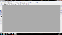
First, open your photo-editing software. (I use PhotoImpact.) Your screen will look something like this:
Now, select the base image you want to use. (Note, if you're going to be making a commercial cover, for purposes of publishing / advertisement, then make sure you own the images you're using. Just because they're on the Internet doesn't make them free. There are royalty free clip art and photography sites you can find with Google. The image below is not the one I used in my original cover (under the "Wolf-killer" tab). I found it online, and it's not mine, so no using it for anything other than fair use kthxbai)
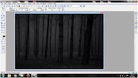 Your image will likely be the wrong size, so you will have to alter it. The specific resolution should be listed on whichever site you're using, so go by those guidelines. For the purposes of this, I went with "sort of book shaped" as the official size :-P
Open a crop-box and highlight what you want to use.
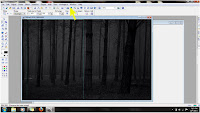 Hit "Crop" and adjust the final size according to your needed resolution specifications. It should look something like this:
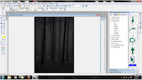
Now you decide what you want for the main image, be it a person, thing, or whatever. This is a re-telling of Red Riding Hood, so I took a photo of a Ren Fest Cape and altered its color to what I needed, then cut out the image:
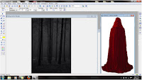 Drag the image over and combine the overlay with the base image:
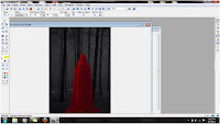
Go around the edges with an eraser to make sure the image is cleanly cut, or else it will look strange in the final product.
Now, to create an appropriately creepy atmosphere, I used the "particle" toolbar and the "cloud" brush to create a blue haze on the background before merging the images, then used it again on the foreground image in a lighter color to give the impression of rolling fog.
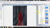
Merge the images into one with the "merge" command.
Type out your title with the default font to make sure it's spelled correctly. (Do not laugh; it happens.)
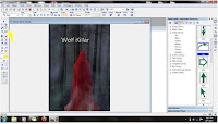
Select the appropriate font from your list and adjust its size and position according to how you want the final image to look. Titles are more than words on paper, they're a matter of composition. Make sure the color and shape fit the rest of the cover's space and tone.
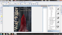
Add your name and a "tagline" to catch a browser's attention.
Save the image as a JPG (or whatever format's required)
Keep in mind that your image should not only look good in color and at normal size, but it should also be attention getting at thumbnail size, as that's what most will see in the e-book store. For Kindle users, it should also be legible in black and white
Any questions? I'll answer them if I can.
7 Chiming In:
You are friggin brilliant. Thank you thank you thank you for the tutorial. You make great covers!
Great post! thankyou!
I've been emotionally moving to the proposition of e-publishing. Covers and editing are the two issues that slow me down. I got excited when I saw the title of your post. But alas...I wanted much more ;O) -- Any recommendations for good sites/blogs that get into more detail (recommendations for) covers and editing?
I've not done any serious research on it myself, but I know people have posted in the self-publishing sub-forum at Absolute Write asking for direction on where to go for cover art. There are some experienced self-publishers there who know much more about the market and resources for it than I do.
I've roughed out a few mock covers recently and found it's really down to how well I know the photo editing tool. I use Gimp and it has lots of powerful features, most of which I'm only beginning to realise are there.
This is a great article, and very useful. Thanks for posting it.
That is completely awesome!
How cool!!!
Post a Comment